Vox Nauseum is a European culture magazine that bridges high and low art, uniting local scenes across the continent.
the voice of reason is felt as the voice of nausea, emerging from the fog of war.
in line with late 20th century emphasis on paranoia, this magazine feels that through the sameness being generated through algorithms, and more recently AI, we’ve entered a collective nausea after emerging from a post 9 11 culture of comfort
collaborate with us [email protected]
The identity of Vox Nauseum is a profoundly urbane one. It takes a cultural baggage/milieu generally associated to a degree of pretension and repackages it as street-level pulp. Consequently, it can be said that Vox Nauseum bridges a high art, low art divide through an original repurposing of the latter that doesn’t involve diluting its contents, but instead placing them in a run down and popular (intended in the class sense) environment.
It doesn’t do this by appealing merely to students and the radical chic, instead aspiring to communicate a certain feeling of listlessness associated with youth through its visual identity (more on this later) and occupation of cultural spaces that treats its audience as capable of consuming mentally stimulating cultural products without the typical pomp and circumstance you’d find in places like art galleries, auction houses, cultural festivals etc. It differs from similar initiatives like squatted cultural spaces by being unabashedly tied to a broader Western tradition in the arts without subverting this influence, despite situating it in new environments.
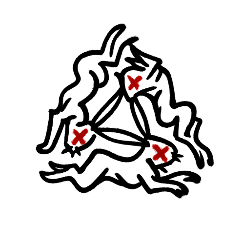
The visual identity of Vox Nauseum is firmly rooted in an environment we’ve all lived and all felt something in: public bathrooms. We base it on both the visual and emotional elements that these spaces hold. Tackling the former first, bathrooms in clubs & bars contain a cornucopia of stickers, etchings, scrawled writings, and a general visual noise and dissonance that remains cohesive through the general run down and recycled nature of these visual elements. Similarly, we aspire to produce a basally loud visual identity that becomes quieted and cohesive through the general wear and tear on these spaces.
On an emotional level a club or bar bathroom provides numerous queues that can inform our brand identity. For example, bathroom are spaces used for many activities each with their own emotional weight. There is the obvious one of relieving bodily needs that we can tie to concepts regarding the inescapability of Nausea as part of the human experience. There is the illicit thrill of taking drugs in a bathroom, the springing of love or lust from concealed sexual encounters, the joy of leaving your mark on a place by scratching your name using a key onto the door, the regret or confusion as to why you’re even in this dive bar at all, or simply vomiting, all of which can provide tonal, visual, and emotive basis for the development of a cohesive brand identity that is legible for everyone (as these experiences are shared by all our prospective consumers). Finally, given the multifaceted nature of the project, we can conceptualize the different avenues we’ll embark in as different stalls, each with its own story and mystery waiting to be explored or stumbled into.